Saturday, 10 July 2010
All this drawing tattoos got me wanting to design my next tattoo. I have a nice space on the outside of my left forearm that needs filling, so i came up with this. I really like the aesthetics of three roses, and the image of Apollo would sit well with the rest of my tattoos. Originally i wanted another full length greek god in this area but then i realised that when the sleeve was finished there would not be a great variation of tattoos on that arm. I feel that the roses would add more to the sleeve when it is complete and just the head of the greek god Apollo would tie in nicely.
This idea came about when I was looking at tattoos of daggers going through hearts. I find myself liking the steriotypical hearts when i look at them but I am not happy with my them when i draw them, so I decided to change the heart element to be an actual heart.
I preferred the idea of a pen penetrating the heart instead of a dagger. I thought this would be better suited to me as an illustration student and the fact that I don't really own any knives or daggers for reference! So i found myself the nicest looking pen (which happened to be a Parker pen i used when i was in school!) It's silver with a gold nib, i feel this will look great when i add colour to it later.
Old school tattoo design
Iv recently become fascinated with tattoo design and I am particularly keen on the old school designs from the 50's, 60's and 70's. I used to be into the traditional style pin-up girls but recently skulls, hearts and daggers have been tickling my fancy. So just for some fun I have been taking the idea of traditional tattoo art and putting my own edge on it. Here are a few examples of the first lot of drawings I have done. I have a few tattoos of my own however not in this style. I have angels and greek gods on my left arm which will hopefully soon be a finished sleeve.
Monday, 12 April 2010
Sunday, 11 April 2010
Wednesday, 31 March 2010
Dog Exercise Machine Brief
Sounds stupid, and it was! However, it was not meant to be a real thing (I don't think!)
It was something to have a bit of fun with, so I decided to make mine quirky.
I started off by drawing dogs that I thought had a certain character about them. I chose Bull Dogs as they are notorious for being lazy!
I thought I could play around with the lazy connotations.
These are design ideas for a re-branding project we were given in the 1st semester of 2nd year. This was our first ever live client brief. We were briefed by Pearlfisher, a company that has re-branded brands such as Green and Blacks chocolate, Absolute Vodka, Famous Grouse whiskey, Stella Artois beer and Innocent smoothies for example.
This was a group project and for this brief we had to research brands that weren't doing so well, and come up with a way of re-branding them into being a beter company.
We chose Snapz. Snapz is a company that produces healthier crisps by substituting the potato crisps for parsnips and apples.
We aimed this product at kids to get them to start eating healthier crisps for their lunches. However, we felt the crisps wouldn't sell if they had 'HEALTHY' branded all over the packet design. We therefore decided to use different characters for the different flavours of crisps. The flavours were Daddy's Cheesy Beans, Grandma's Bramley Apple Pie, Granpa's Fish Finger Butties, Aunties Toffee Apple and Mummy's Sunday Dinner.
Below is some of my character designs.
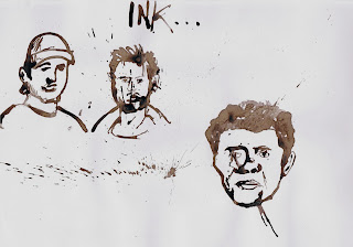
Observational drawing using inks. I chose to use brown ink as it wasn't so harsh on the paper. It was like drawing with a mid-tone and I really like the way it has turned out.
In the first image you can see I have drawn a man who was sitting reading a book on his lunch break. He was wearing a funny hat around his head so he seemed a good character to draw. You can also see an image of an eye. This is my eye, I used a mirror in front of me to draw from observation as we weren't meant to be using photographs or other imagery.
In the 2nd image used 3 lads as my subject. One was wearing a cap, so it gave me something different to draw. The other had well groomed facial hair, which gave a lot of personality to the drawing, and the 3rd had a small, neat afro hair cut.
I have chosen to specialise in illustration as I felt this is what would suit my talents best. Illustration combines drawing, painting, printing and photography, all of I am competent and believe I have talent in. The below images are from the 1st illustration module we were given at uni. They were quick drawing exercises aimed at 'loosening' our drawing arms up! For these images i have used different drawing techniques ranging from drawing with my left hand (wrong hand) to drawing with my eyes closed, using different mediums, for example biro pen, ink and pencil.
Subscribe to:
Posts (Atom)